Your website should be an accurate reflection of your small business. So, if your existing site needs a facelift, or if you’re just starting to think about creating a website for your small business, keep that overarching goal in mind.
The layout of your website plays a huge role in how well it converts customers—or convinces visitors to contact you, fill out a form or schedule an appointment. In fact, 94% of first impressions are design driven, and it takes visitors less than half a second to decide if they like your site or not. In short, a lot is riding on your website.
While colors and graphics are important elements of a website’s design, the layout has the biggest impact on user experience and conversions.
Elements of a Strong Layout
Easy to Use and Navigate

Visitors to your site should be able to find what they’re looking for without having to think too hard. That means keeping your navigation menu organized and intuitive. Make it predictable.
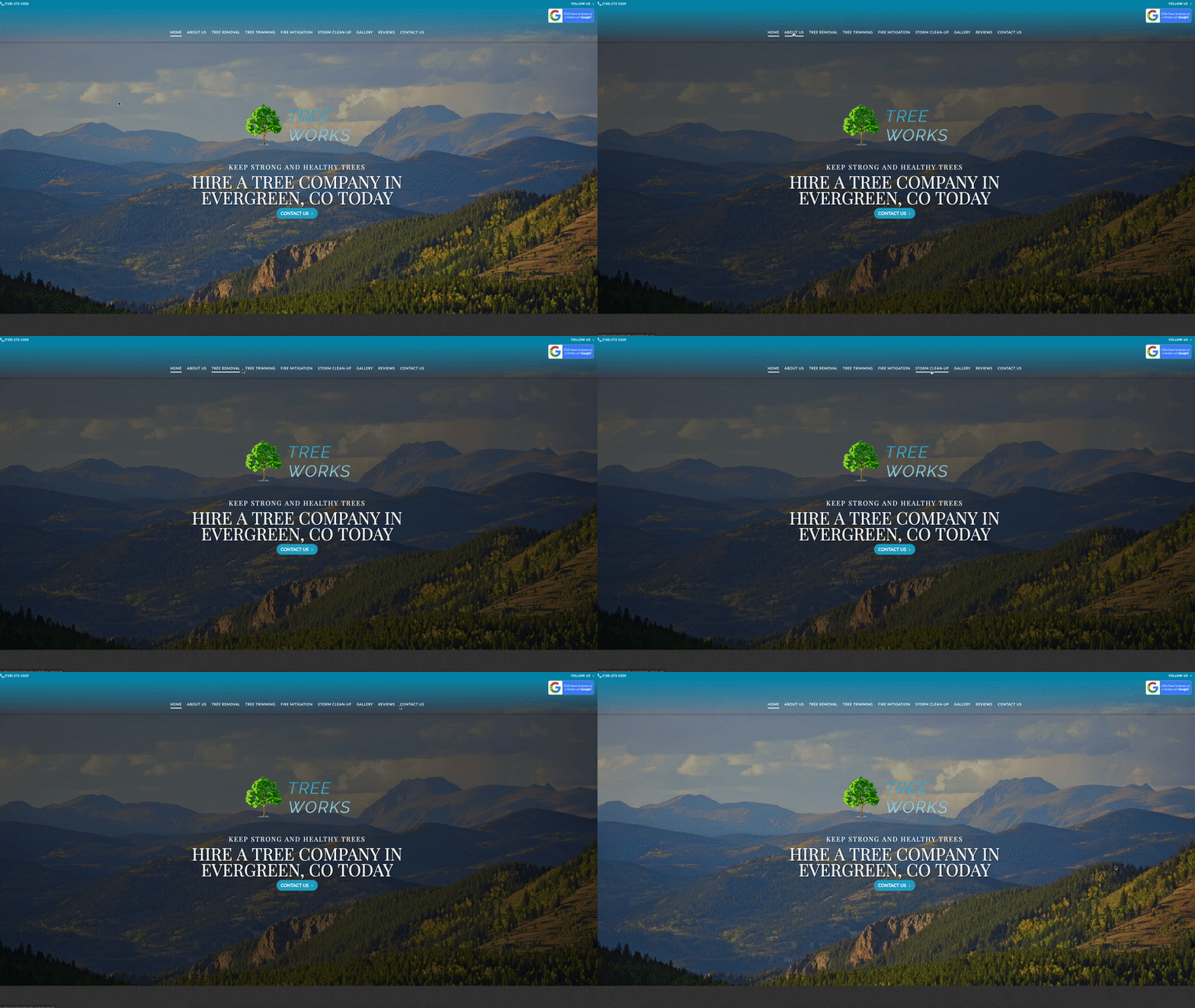
Let’s start at the top of this example—that navigation bar. It has the most prominent spot at the top of the page, stands out against the background, is clearly labeled and doesn’t leave you wondering where to look for pictures of their work, reviews or how to contact them. You’ll also notice their phone number in the top left corner, as well as a call to action (CTA) to leave them a Google review in the top right. Overall, this is a great use of space.
Efficient With Content and Visual Elements

Cut out the filler—it’s got to go. Tell your visitors what they need to know to make a decision, then move on. Keeping your content clean, organized and succinct will allow you to take advantage of negative space on the page, which is a huge plus for your layout.
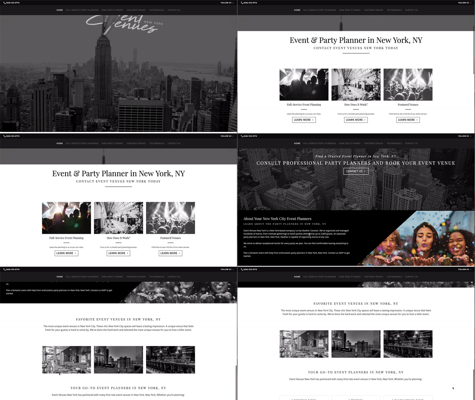
This website is a fantastic example of how using negative space can pull the design together. The copy is direct and short, which allows other elements within the layout to catch and draw the eye. In this case, that’s the clean black-and-white imagery that surprises the user with a pop of color when the cursor hovers over it. Overall, the use of negative space embodies the sophistication and professionalism this event planning business wants to convey to its potential customers. How will negative space play into your website’s design?
Includes Strong Calls to Action

Your website’s goal is to convert visitors, so make sure you’re giving them every opportunity to do so. Strong calls to action (CTAs) should entice visitors to click, call, fill out a form, schedule an appointment and more. It’s a good idea to include a CTA at the end of each section of the page.
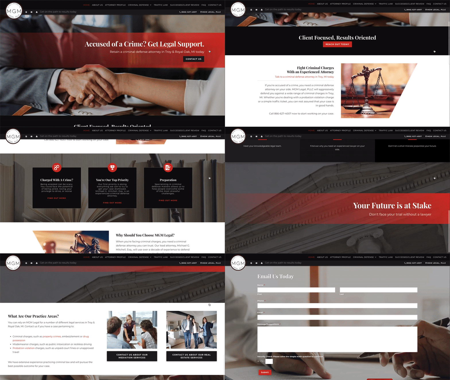
On top of being another example of good use of negative space, this website does a good job of laying out information in neat blocks that don’t contain an overwhelming amount of content. The design also includes powerful imagery related to law and includes CTAs in good locations—in this case, Find Out More and About Us.
Mobile-Friendly so Everyone Can Use It

Not all of your customers are going to find your website on a computer—most are using mobile devices to search for the products and services they need, so make sure your website is mobile friendly. It shouldn’t look clunky or be difficult to use on mobile. If they have to pinch and zoom to read small text, hunt for tiny links or try creative ways to view content that’s been cut off, your site is not mobile friendly.
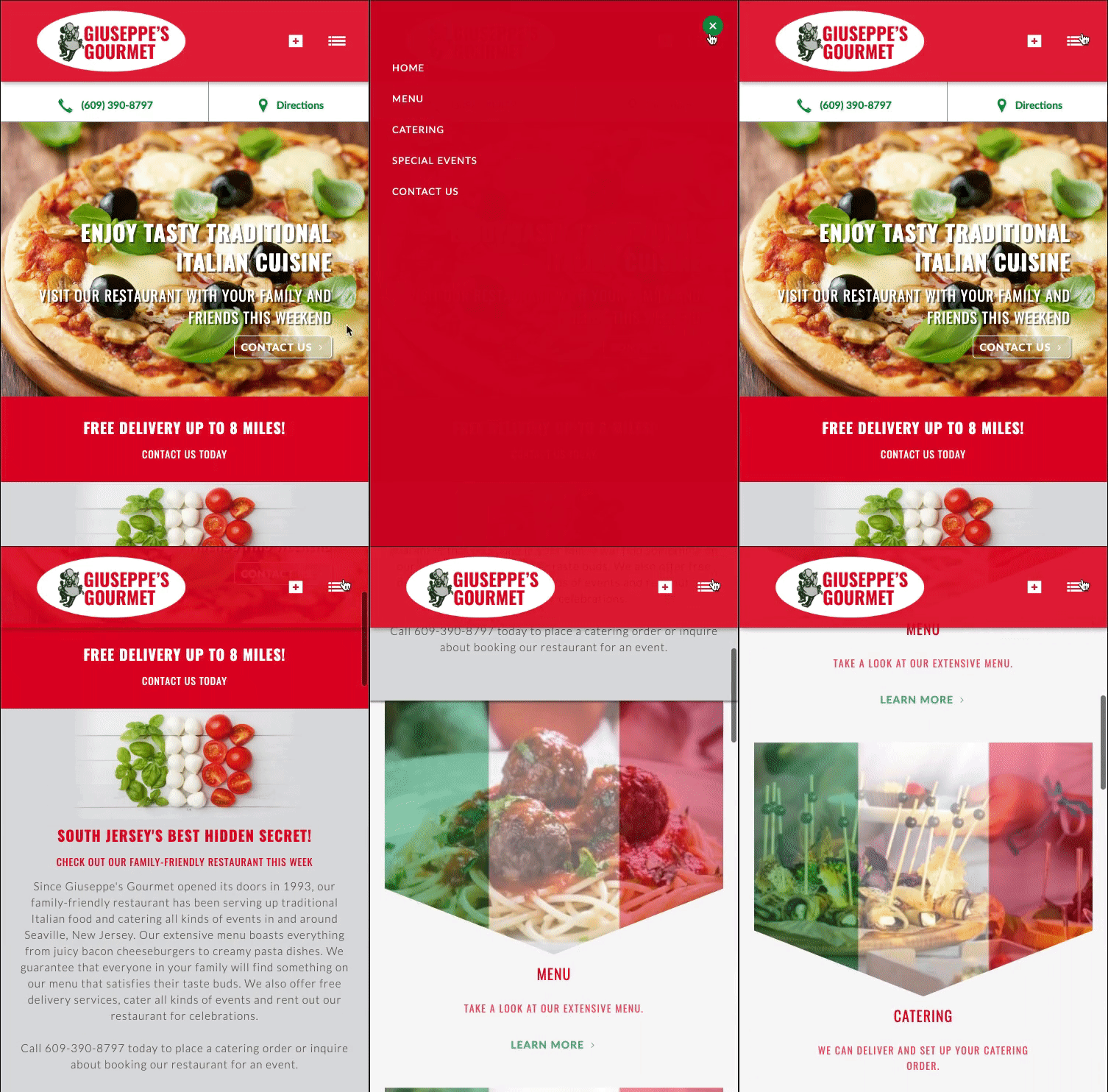
Finally, we have an example of a website that is optimized for mobile use. The menu is hidden in a drop-down in the top-right corner for ease of use, and the imagery and layout have realigned themselves to flow well on a smaller screen – all without losing any of the attractive elements of the site.
How Can Layout Help Your Small Business’s Website?
Now that you have an idea of what goes into a good layout and what that looks like in practice, how do you envision your small business’s website? If you want some help making that vision a reality, fill out the form below. One of our digital marketing specialists will reach out to you to discuss your small business and your future website.
.png)